Focusrite
Refreshing a well established brand
Brand
- Focusrite
Date
- June 2019
The Team
- Simon Peacock – Creative Director
- Ben Bates – Lead designer
- Alex Wood – Web design and UX
- Mark Swallow – Photographer
The project
Like many brands, Focusrite was guilty of not spending enough time thinking about how their customers were evolving in an ever changing and somewhat cluttered market space. Behind the scenes marketeers and brand aficionados had worked up personas specific to the product segmentation roadmap. Any Creative Director will tell you, having a clear customer to target allows for much more effective campaign concepts that will reap the desired results.
With these personas in-hand I was able to show that the entire brand needed a refresh to allow us to make the most of new copy, some firmer brand values and new mission and values statement. We set about bringing some life back in to the Focusrite brand. It’s worth pointing out that Focusrite wasn’t a lifeless corpse struggling to make itself seen, it was and still remains the world’s best selling audio interface manufacture with some product lines dominating over 60% of the market. What I had spent the years prior doing was focusing on the build quality and the styling of our interfaces. This was, at the time, and remains, something that we knew customers valued and we did a great job of making Focusrite products exude class and build quality, but now we had a stronger understanding about the people buying the products.
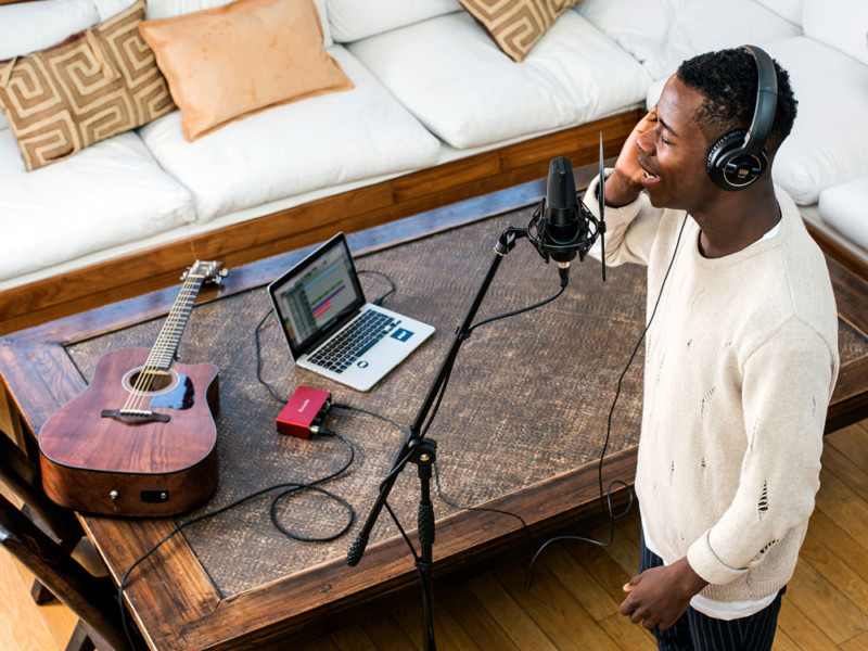
So, we needed a change of direction and I wanted it to be more about people, not only in our photography but in video too. We spent time building sets for shoots, picking artists and models that could fit in to persona categories. Also, we started to focus on artists background stories, if we were filming a performance we built in time to film behind the scenes and interview them. Always trying to produce something relatable that helped position the customer engaging with the content more clearly in their own journey.
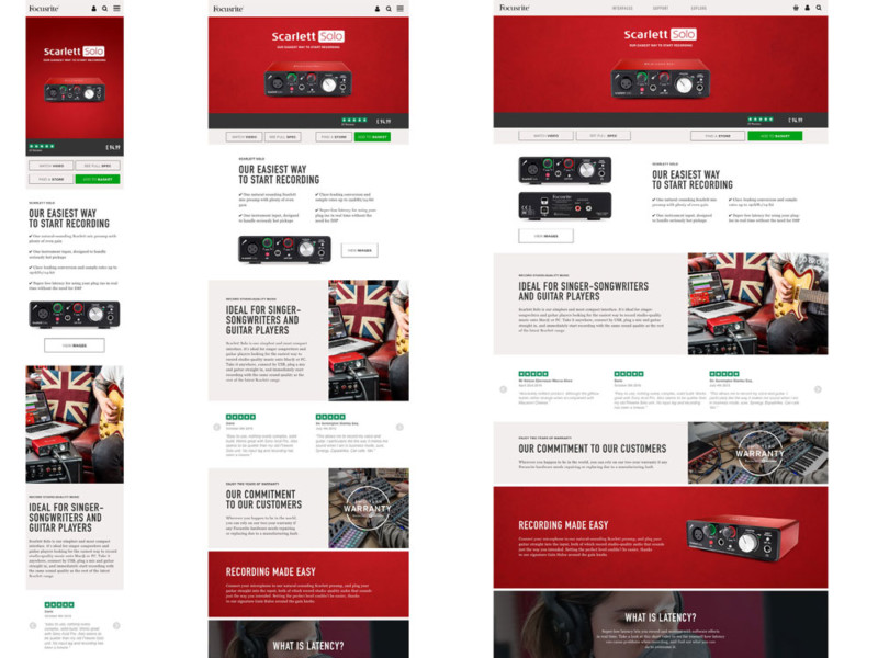
The big 3. Phones, tablets and desktops.
An all new responsive website was built with a brand new CMS. Don’t under estimate the significance of this, I’m not joking when I say that the previous site was as stable as a new born calf. Anyway, we knew we had the opportunity to UX the site with customer heatmap insights and some dry run testing. We planned the design around an easy to build modular structure, the sites were to be looked after by an ecommerce team so making any design decision as straight forward as possible offered the level of control we demanded.
A picture sells a thousand units
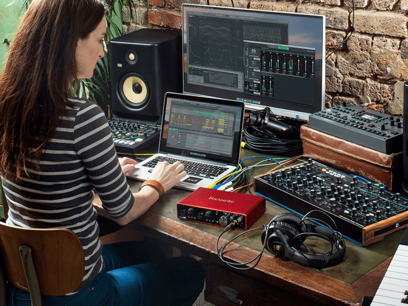
With the personas in-hand we could plan our images with precision. Models, artists, locations, mountains of instruments and cables were pulled together so every detail of the shot was considered.
“Would they play a Squire Strat or a Telecaster?”, “what’s their income?”, “they’re buying our cheapest interface”, “they’re only just dipping their toe in to recording” and we’d conclude they’d be a Squire Strat owner. These questions continued, and continued, but that level of detail strengthens the final image.
"We needed a change of direction and I wanted it to be more about people."
