Focusrite Pro
Rebrand of Focusrite’s Professional Audio Solutions division
Brand
- Focusrite Pro
Date
- March 2018
The Team
- Simon Peacock – Creative Director
- Alex Wood – Lead designer
The project
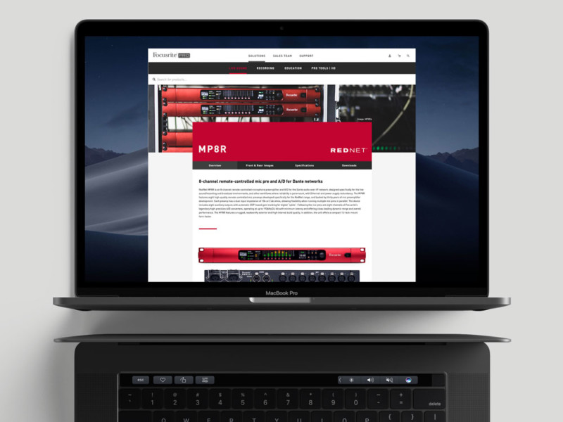
Audio over IP was a technology that had started to gain traction in the audio world. In simple terms it was a method of taking large audio setups, like a huge front of house desk with miles of different cables running out of it, and turning that in to a single CAT5 ethernet cable connected over a network. The potential was massive and Focusrite led the way. At this time Focusrite’s higher end products remained under the Focusrite brand but that brand was now catering to someone looking at spending £99 on their first interface for their bedroom setup. A few clicks away they’d be looking at an interface with enough inputs to be found in Abbey Road (which is worth pointing out, they actually are found there). The opposite was true too, clients looking to invest thousands in a new audio equipment would be equally confused why the same company made a £99 unit. It wasn’t ideal when driving traffic to a site with such a broad price point offering and a tone of voice that went from talking to a beginner to a seasoned professional.
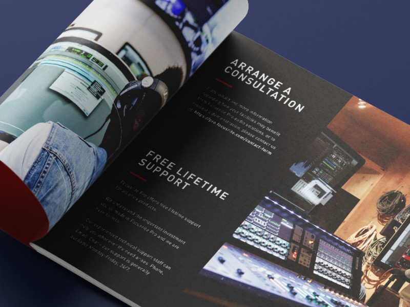
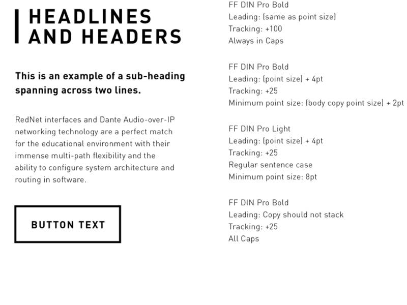
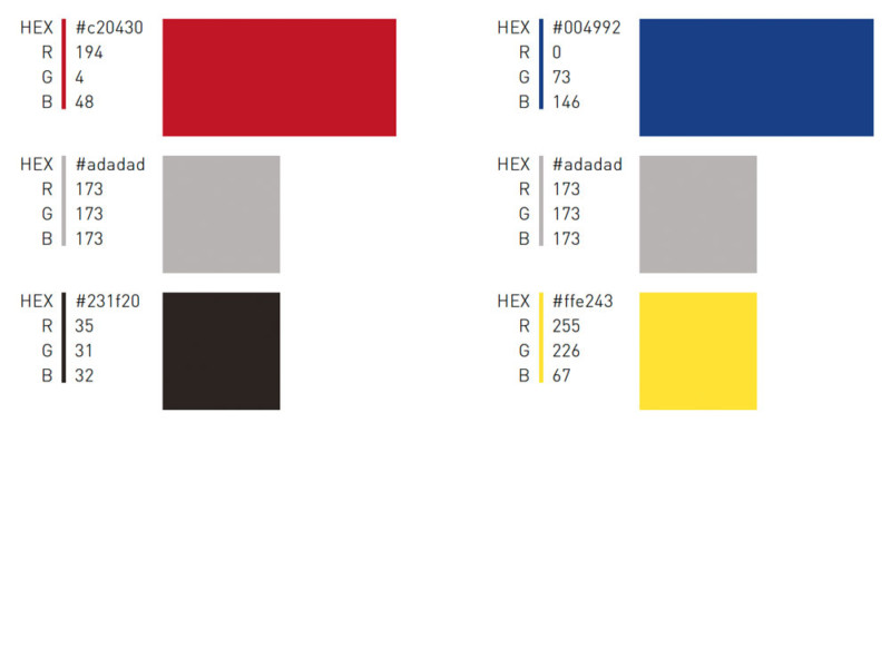
Focusrite Pro was created. A division of Focusrite where the higher end products could be separated away and occupy a space where clients felt they were going to be led to the solution they need. This wasn’t a branding project that required fussiness and flamboyant design, the target customer was entering a long and considered purchase funnel. Information had to be clearly presented, typography and type hierarchy styling dominated the early design decisions. The colour palette was drawn from the product ranges, that gave us a strong red and blue as our lead colours and blacks, greys and yellow to support them.
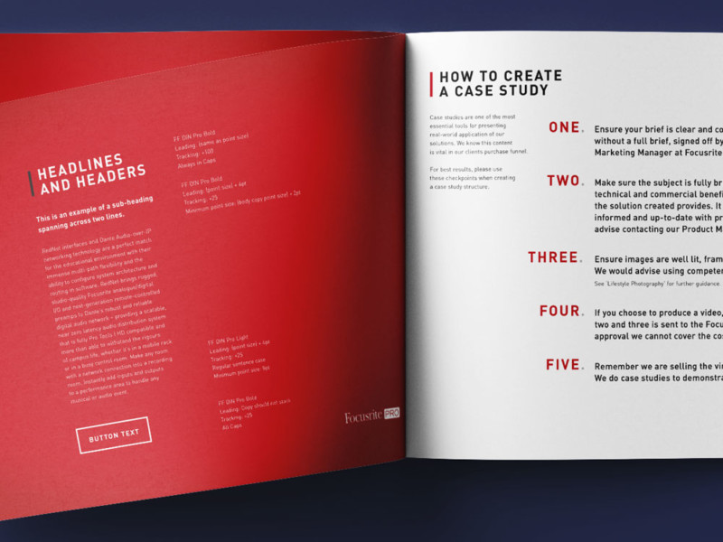

Typography
Colour
"Whilst rules are meant to be broken, these ones aren’t."