Focusrite Group
With more and more companies joining the Focusrite family a solid ID to house them was needed.
Brand
- Focusrite Pro
Date
- February 2020
The Team
- Simon Peacock – Creative Director
The project
Focusrite was growing, it had been securing more investment and bringing new companies under the PLC umbrella. That created the need for an ID that could contain all these visually different brands. I didn’t want it to be too fussy and it couldn’t be too closely tied visually to any of the brands.
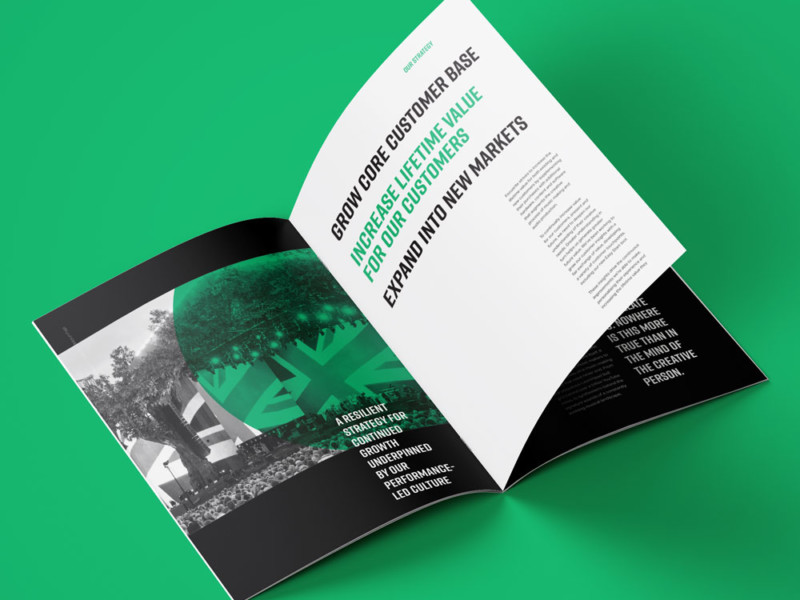
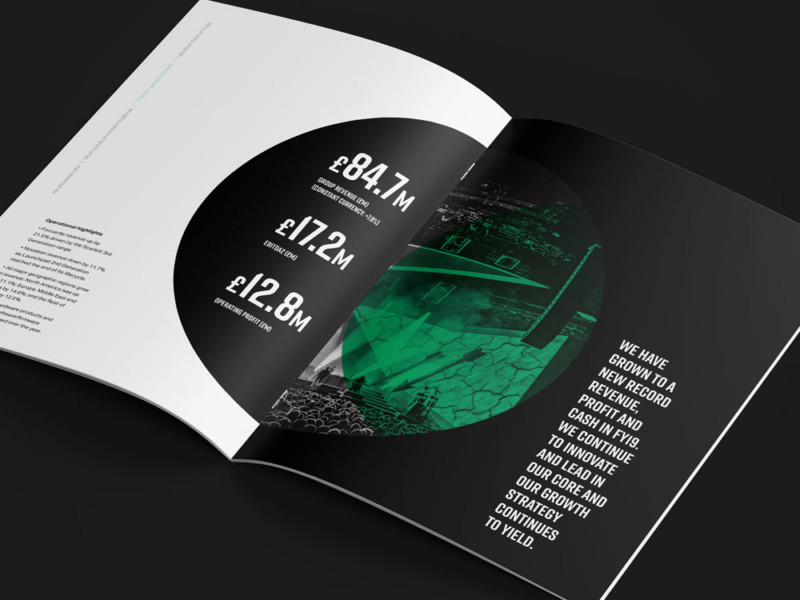
Using a circle as a graphic element gave the design something to play off, a circle feels inclusive which was fitting for this growing family. A restricted colour palette wasn’t pulling your eye all over the page unnecessarily and the minimal type hierarchy allowed us to focus on the 3-30-3 concept. 3-30-3 is commonly talked about in web design but I have always applied it to large information heavy documents. Regardless of how much effort has gone in to the copy some people just want the highlights, but surely you can entice them to read on. Step forward the first 3, that’s those initial 3 seconds you have on a page to deliver some key information, big bold statements. Then 30, up to 30 seconds worth of information to read. A quote or synopsis of the larger body of text, handled in a reasonably bold way but appreciating it needs to be read. The final 3, a 3 minute read, after the initial 3 seconds or 30 seconds have captured interest there is the raw information that will give you the full story. Good typographic hierarchy is key here, and I bloody love a bit of that.

"3-30-3 is commonly talked about in web design but I have always applied it to large information heavy documents."